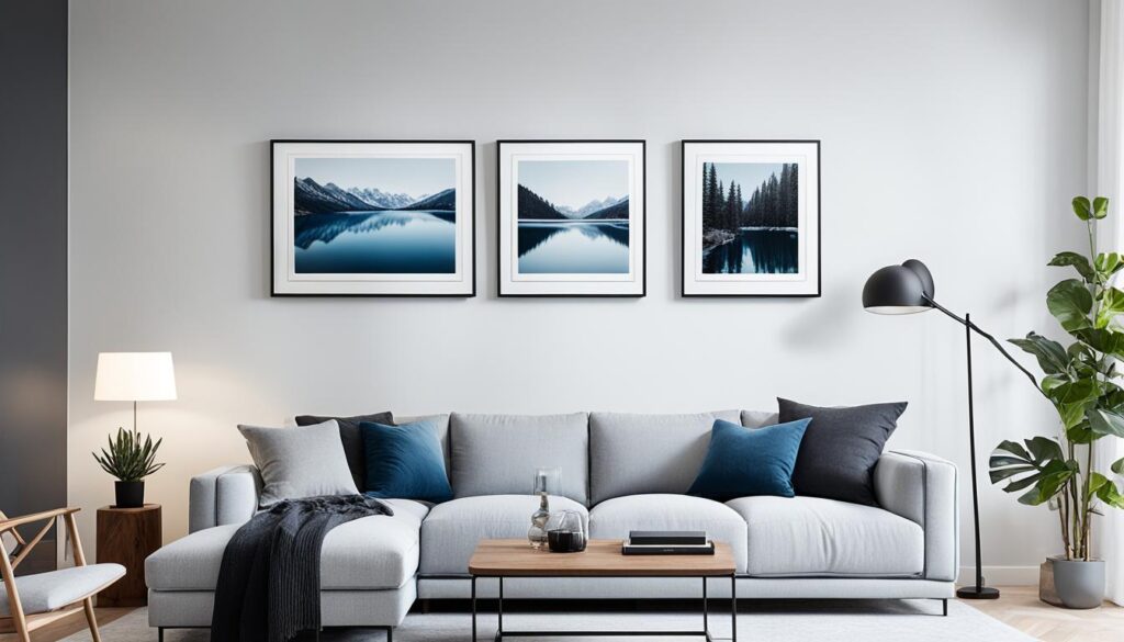
Finding the right color scheme for your home is an exciting journey. It can turn your living spaces into cozy and stylish havens. This article will help you pick the best colors to boost your personal style and make your home feel connected.
Do you like bold colors or prefer soft tones? Knowing about color theory and applying it to your decor can change everything. We’ll look at how color affects interior design, the difference between warm and cool tones, and how to keep colors flowing smoothly from room to room.
There are many options, from accent walls to monochromatic designs. By the end, you’ll know how to pick a color scheme that shows off your style and improves your home’s feel.
The Power of Color in Interior Design
Color is a key element in interior design. It can change the mood and feel of a space. By using color psychology, designers can make spaces that evoke certain feelings and improve well-being.
Color Psychology and Its Impact on Mood
Colors can make us feel different things. Warm colors like red and orange bring energy and excitement. On the other hand, cool colors like blue and green make us feel calm and peaceful. Designers use this to create the right mood in a space.
Trends in Color Combinations for 2023
Design trends change, and so do color combinations. In 2023, complementary colors are getting popular. These colors are opposite each other on the color wheel and create a strong contrast. Monochromatic palettes are also on the rise, offering a sophisticated look.
Knowing about color and trends helps designers make spaces that are both beautiful and emotionally uplifting. Whether you like bright colors or prefer monochromatic tones, color psychology is key to great interior design.
Defining Your Personal Style
Before picking the right colors for your home, it’s key to know your interior design preferences and personal style. Understanding what you like is the base for choosing the best colors, textures, and furniture. This makes it easier to decorate your spaces.
Think about the design styles you like. Do you like modern with its clean lines or the cozy feel of traditional décor? Maybe you want a mix of both. Knowing your interior design preferences helps pick the right color schemes for your look.
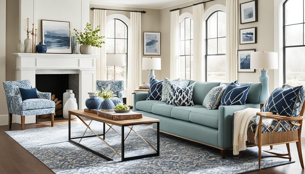
Also, think about the mood you want your home to have. Do you want it bright and lively or cozy and intimate? Your personal style affects the colors you choose, as different colors can make you feel different things.
By defining your personal style and interior design preferences, you’re ready to pick a color scheme that shows your unique taste. This makes your home feel just right.
Understanding Color Theory Basics
Exploring color theory basics is key to creating a cohesive and eye-catching color scheme. This section will cover the relationships between primary colors, secondary colors, and tertiary colors. We’ll also look at complementary colors and analogous colors. Knowing these concepts helps you pick the right colors for your home.
Primary, Secondary, and Tertiary Colors
The primary colors are red, blue, and yellow. They are the base of the color wheel and can’t be made by mixing other colors. Secondary colors come from mixing two primary colors, giving us orange, green, and purple. Tertiary colors are a mix of a primary and a secondary color, like red-orange, blue-green, and yellow-green.
Complementary and Analogous Color Schemes
Complementary colors are opposite each other on the color wheel, like red and green or blue and orange. These colors stand out well together and are great for highlights. Analogous colors are next to each other, such as blue, blue-green, and green. They create a smooth and connected color scheme.
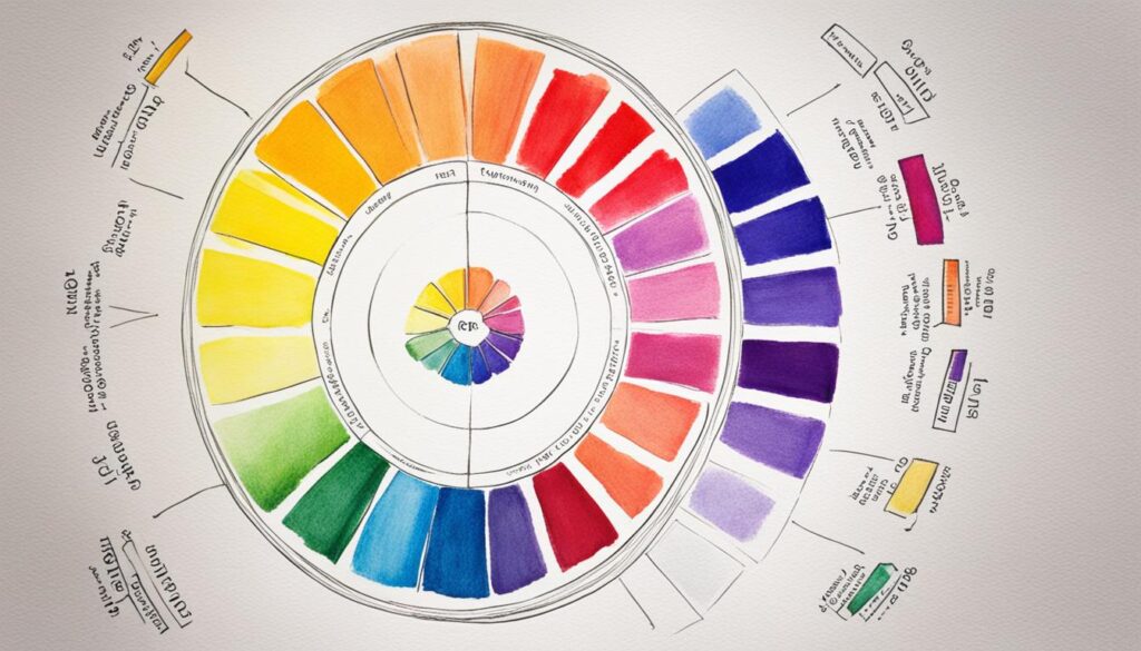
Learning these color theory basics lets you pick and mix colors that match your style. It also sets the mood and feel of your living spaces.
Creating a Cohesive Color Flow
Making your home look connected and harmonious is key. It’s all about planning the color flow from one area to another. This is especially true in open-plan living spaces and when moving between rooms.
Open-Plan Living Areas
In open-plan areas, the flow of color is vital. Choose colors that work well together to make moving from one area to another smooth. Start with a main neutral color, then add accents of similar hues to connect everything.
Transitioning Between Rooms
When moving from one room to another, the colors should connect well. Don’t switch colors suddenly, as it can break the home’s harmony. Instead, use slight changes in tone or color to keep things flowing.
You can do this by using the same color in nearby rooms or choosing colors that are similar. This makes the transition smooth and pleasing to the eye.
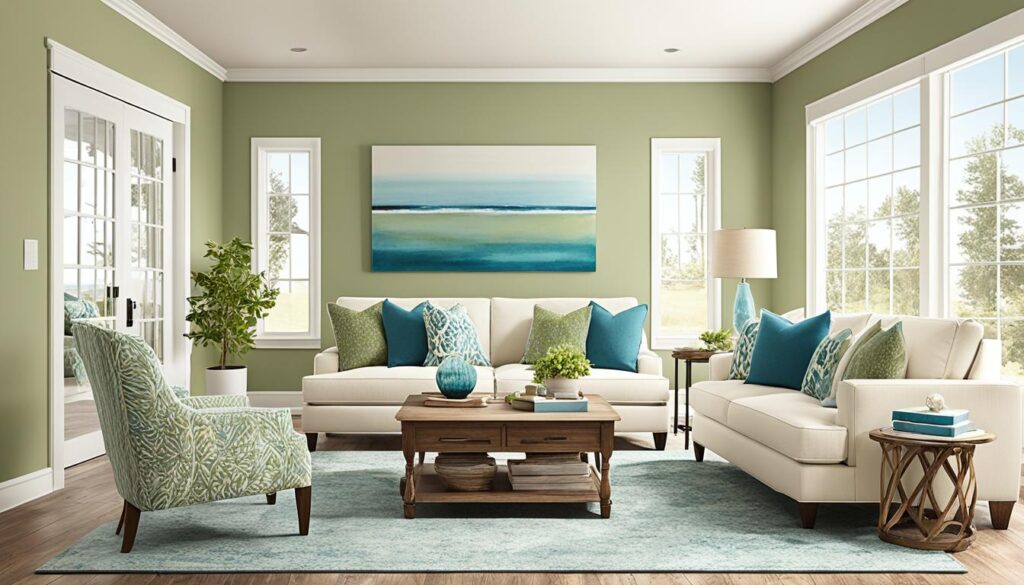
A well-planned color flow does more than look good. It can also make your home feel bigger and more welcoming. By picking colors carefully, you can create a space that’s both beautiful and cozy.
Choosing the Perfect Color Scheme for Your Home
Finding the right color scheme can make your home look better and feel more harmonious. Choosing the best paint color selection means thinking about room size, lighting, and your personal style.
The size of a room affects color choice. Small rooms look better with light, bright colors that make them seem bigger. Big rooms can handle bold and bright colors. The amount of natural light in a room changes how colors look.
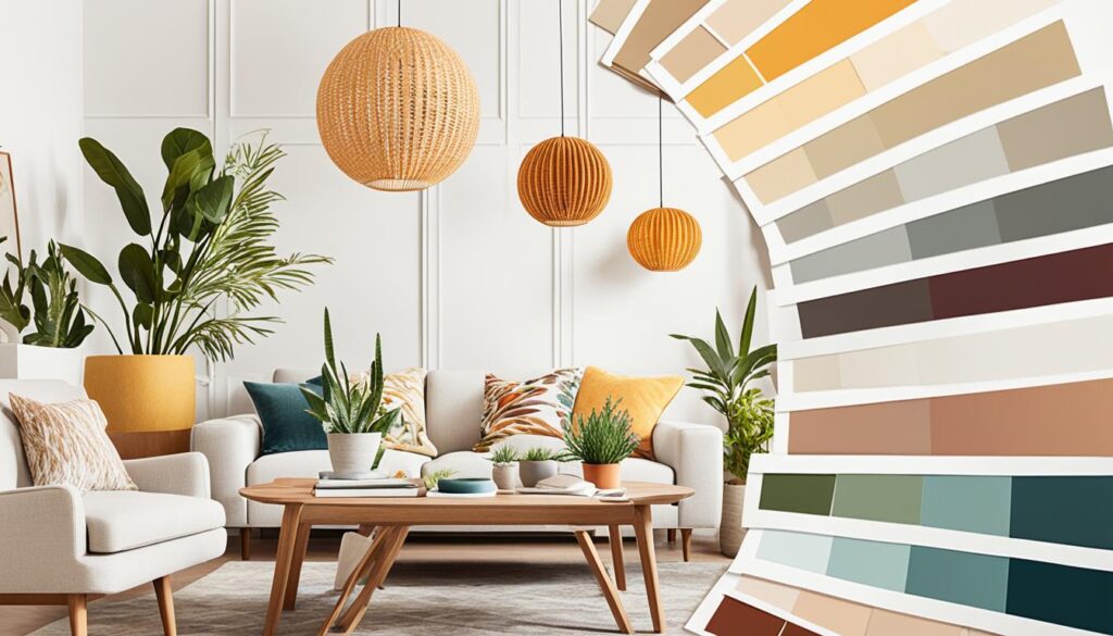
Your design style is also important when picking a color scheme. If you like modern and simple, go for a monochromatic palette. For a traditional or cozy look, choose warmer, earthier colors. The paint color selection should match your taste and the mood you want for each room.
Think about these factors to create a color scheme that looks good and works well. With the right color scheme, your home will feel welcoming and balanced.
Incorporating Accent Hues
Using a cohesive color scheme is key for a harmonious interior. Adding accent hues can bring depth and interest. Accent walls and architectural features can make your space more dynamic and captivating.
Accent Walls and Architectural Features
Using an accent wall is a great way to add accent colors. Paint one wall in a bold, contrasting shade to create a focal point. This works well in open-plan living areas, dividing the space.
You can also highlight architectural features with accent colors. Paint the trim, molding, or ceiling in a contrasting hue. This draws attention to your home’s unique details, like high ceilings or decorative archways.
When picking accent colors, think about what complements your main color scheme. Bright, bold shades make a statement. Or, choose softer tones for a subtle look. Try different combos to match your style and improve your home’s design.
Warm vs. Cool Tones
Understanding the difference between warm tones and cool tones is key to making a cozy living space. These colors affect the feel of a room deeply. They can change the mood and look of a room.
Warm tones like reds, oranges, and yellows bring a cozy, energetic vibe. They make rooms feel welcoming, perfect for the living or dining area. Cool tones, on the other hand, include blues, greens, and purples. These colors create a calm, spacious feel.
Balancing Temperature for Comfortable Spaces
Finding the right mix of warm tones and cool tones is crucial for comfortable spaces. This balance makes a room look good and interesting. It helps create a sense of flow.
For instance, a warm-toned accent wall in the living room can go well with cool-toned furniture. A warm-toned wood table in the dining room can match cool-toned chairs. Mixing these colors makes a design that looks good and meets the room’s needs.
Choosing between warm tones and cool tones depends on what you like and the look you want. Knowing how color temperature changes a room’s feel helps you make better choices. This way, you can create comfortable spaces that show off your style.
Monochromatic Palettes for Sophisticated Spaces
Creating sophisticated spaces is easy with a monochromatic palette. This method uses one color in different shades to make rooms look elegant and refined.
Using one color lets you make a room look connected and balanced. You can pick any color, like soft gray or deep charcoal. This way, you can make a room that catches the eye.
A monochromatic palette adds depth and texture to a room. It uses different shades of the same color to make the space interesting. This stops the room from looking flat.
Also, a monochromatic color scheme highlights your home’s best features. If you have a beautiful fireplace or stunning moldings, they’ll stand out more in a room with a monochromatic palette.
Feng Shui and Color Principles
The ancient Chinese philosophy of *Feng Shui* teaches us about color and energy in spaces. It shows how certain colors can improve the energy and harmony of your home. By using Feng Shui color principles, you can make your living space better.
Enhancing Energy Flow with Color
*Feng Shui* says color greatly affects the energy, or *chi*, in a space. Each color is tied to different elements and energies. Using these colors wisely can make your home feel peaceful and refreshing.
For example, *red* is linked to fire and boosts energy and passion. *Blue* is connected to water and helps you relax and think deeply. Using these colors in the right spots can improve your home’s energy flow.
Knowing about *Feng Shui* color principles can help with your design choices. By matching your colors with Feng Shui, your space will look good and feel welcoming and refreshing.
Visualizing Your Color Scheme
Creating a color scheme for your home needs careful planning and visualization. Using color mood boards is a great way to try out different colors and textures. This helps you pick the perfect colors for your space.
Creating Color Mood Boards
Mood boards are like visual sketches that combine colors, fabrics, and images. They help you see how your space will look. By making a mood board, you can test different color combinations. This way, you can find the best color scheme for your home.
Start by collecting images, paint swatches, and fabric samples that match your style. Put them on a board, either physical or digital, and try different layouts. This will help you find the right mix of colors, textures, and accents for your desired look.

